
Design plays a crucial role in keeping your visitors gripped and helps in transforming them into buyers. With the attention span of average Internet users being merely 8 seconds, your eCommerce web design should not merely lay emphasis on making your website artistically alluring but more importantly aid the visitors in finding the products they are looking for.
Buyers visit your website with the purpose of buying a particular product. They do not have the time to spend a few minutes to look for the desired product. If a buyer has to make any extra effort in looking for products, you might be leaving a good sum of money on the table.
The following points act as an obstruction in the path of accomplishing the real purpose of your site-securing sales.
Hard to find search bars
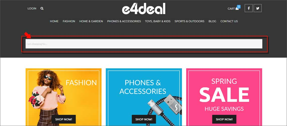
During eCommerce website development, it should be kept in mind that the search bar is placed right before the buyer’s eyes so that they can directly look search for the intended products. Not only this, you should equip it with relevant filters that help in getting refined results thereby reducing the time taken in looking for products and enhancing the overall buying experience.

Additional final cost
Any additional charges associated with the product should be shown on the product page or shopping cart page itself. According to a study, shipping costs that come to the notice of the customers directly at the time of checkout carry high risk of cart abandonment. For this, a shipping cost calculator can be added on the product page at the time of eCommerce website design and development to calculate the final cost of the product before proceeding to the ‘Checkout’ page.
Out of stock products
Make all possible attempts to replenish your stock well in time to avoid any unnecessary hassle. However, in case your products run out of stock, notifying the customers of their “out of stock” stature is recommended instead of making false promises about speedy delivery (which create a negative image of your brand/store). They can be notified when the products get restocked. Removing certain products from listing and uploading them all over again is not a recommended practice from SEO’s viewpoint.
Difficult to find get in touch
While shopping online, potential buyers may have doubts pertaining to refund and return policies, shipping time, etc. In case of non-clarity on any of these (despite clearly listing down all your policies and procedures on your site), it is very likely that they wouldn’t proceed with making a purchase. Creating an easy “Get in Touch” option at the time of development helps in driving away their clouds of doubt. It helps you in banking upon an opportunity you would have easily lost otherwise.

Lack of simple product preview
Giving your customers a chance to have a quick glimpse of a product can help in making a great difference to your sales figures. It typically allows visitors to take a speedy peep into product price, image, description, etc., with the help of an overlapping image without the need to open the entire product page itself. Ideally, it should also be equipped with the “Add to Cart” option.
Expert advice: The less the time taken to reach the ‘checkout’ page from landing page, the more are the chances of securing a sale.
Get in Touch!
Planning to add that missing spice to your website’s design? Our eCommerce Website Design and Development Services can give you a competitive edge by taking your website’s design to the next level. You can reach out to us at info@suntecindia.com and drop a line about your project’s requirements.

