“The best dollars an eCommerce business can spend are on user experience.” -Jeff Bezos
If you go back to the interviews that the Amazon CEO delivered before 2000, you’ll discover many such wisdom nuggets. Bezos was foresighted about many things. But, he was unusually spot-on with his user interface and consumer experience insights.
And, he stands corrected even after two decades.
- Strategic UX/UI can increase conversion rates by up to 400%.
- Every dollar invested on UX can return anything between $2 to $100
- 79% of customers highly prioritize online user experience
Simply put, UI & UX are critical parts of custom eCommerce design. They have the power to convert visitors into transacting customers. Shoppers value the friction-free experience resulting from a decent UI. And, sellers have tangible returns to show for investing in UI/UX.
Therefore, if you ignore the look & feel of your eStore, or how it supports a buyer’s journey, you’re missing out on potential revenue. That’s why we’ve come up with a brief guide on critical ways to enhance overall UI/UX for your eStore.
4 Tips for Impactful eCommerce UI/UX Design
1. Clear Navigation & Straightforward Visual Hierarchy
Here’s the biggest tip of all.
If a consumer visits your website but leaves without buying, then you lose money. No matter how stylish or trendy the design is, it means nothing. No matter how incredible the content is, your ROI will still sink.
That is what a good custom eCommerce design should avoid. And, that’s where a visual hierarchy and clear navigation come in handy.
Here’s the thing-the quality of website design is a culmination of many factors. But, in the end, its efficiency is analyzed by a simple formula- the total number of completed transactions. Ideally, a custom eCommerce design should lead people to buy your products. It should be subtle yet strategic, understandable, well-structured, and purposefully organized.
Good navigation makes it easier for a visitor to
- Move around your eStore
- Locate what they are looking for
- Buy/subscribe or take another intended action
Visual hierarchy, on the other hand, clarifies the vital aspects of the eStore to the user, like-
- The brand plus the eStore’s objective
- Location of essential components, like the menu, filters, home page, catalog, search bar, etc.
- Product information
- Seller information and contact options
- Buying/wishlist Options
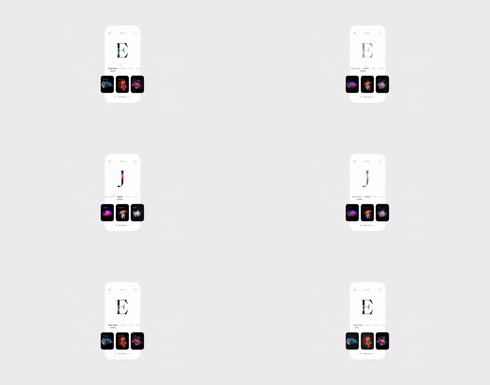
Germinating from the Gestalt psychological theory, visual hierarchy in UI is based on a user’s perception and comprehension tendencies. It suggests keeping critical content above the fold to attract the user’s attention. It also advocates keeping the layout scannable, since people like to get a sense of the page before diving into it.
Here are a few other tips that you can utilize in any custom eCommerce website design-
- Use the white space in balanced proportions to create an effective layout
- Use grids when structuring the page to ensure proportional organization with ease
- Choosing different colors can help separate the core elements
- Combine fonts to establish a contrast between more prominent copy and ordinary text
- Small screens have even less space so design visual hierarchy for mobiles more carefully
Remember, the objective is to create smooth navigation & problem-solving interaction through a functional organization of UI elements.
2. Aim for Minimal User-Clicks
What you do to save the time and effort of a user says a lot about your customer service standards.
There are many ways to achieve an optimized user experience. But, the working principle is to save as many clicks as possible. If a user has to go through several stages/operations to achieve a single action, they won’t be pleased. Not to mention, that would leave a poor impression on the visitor and might cause them to abandon the cart or dismiss purchase.
- Display related products and recommendations similar to what the user is searching for
- Simplify product selection and buying process
- Keep the sign-in/log-in and check-out process as minimal and quick as possible
- Use shapes and colors markers to group content and simplify navigation for the users
- Avoid loud colors, unreadable fonts, frequent pop-ups, or aggressive backgrounds
Also, when applying custom eCommerce design to your eStore application, remember to stay in the thumb-friendly zone. You can also use the “Load More” button to give the user control over their browsing choices.
Quick Note: The thumb-friendly zone is the space on a mobile screen that a user can easily reach with their thumb while holding the phone in the same hand.
It’s also a good practice to provide many sign-in options, preferably quicker ones. 28% of shoppers abandon carts if they don’t see a guest check-out option. A fair share of buyers don’t feel comfortable sharing personal information or filling long forms for a simple purchase. Many others prefer the single-click sign up through social media.
So, include plenty of sign-in options as well as check-out options to make it simpler for the visitor to make a purchase.
3. Dedicate Your Landing Pages to Specific Purposes
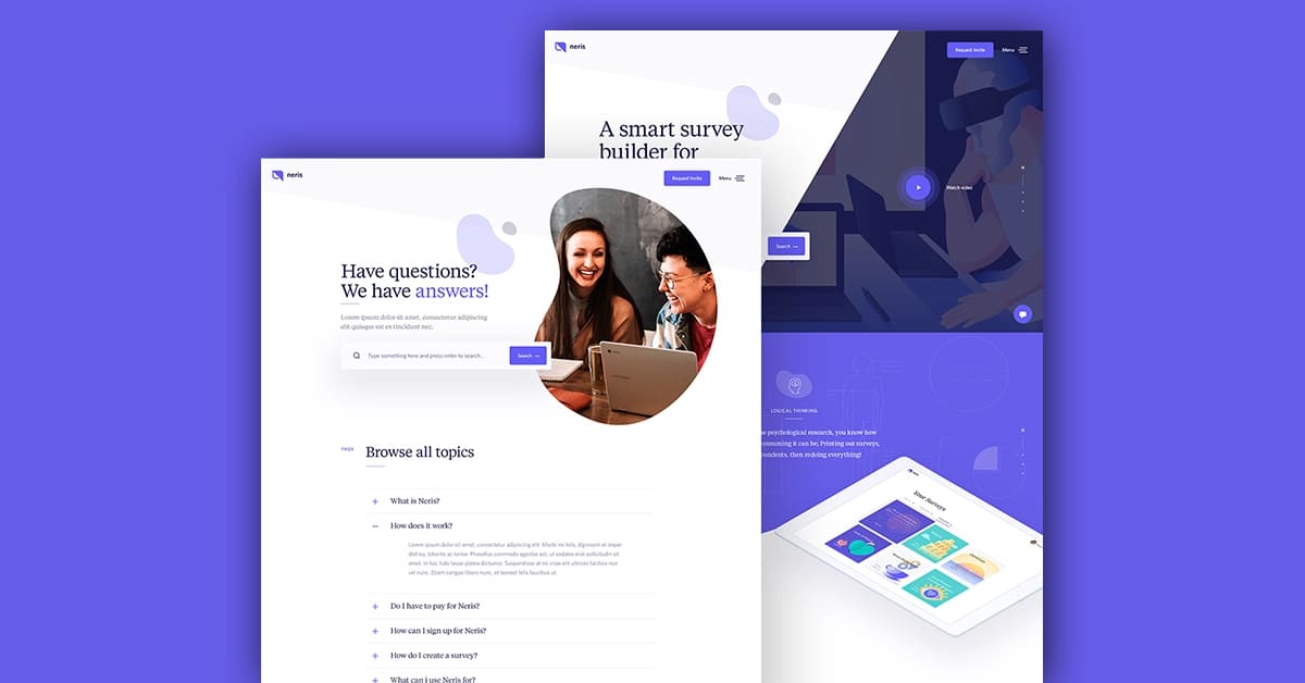
Landing pages are usually created to focus on a single marketing goal. They are used to save a user from overwhelming information and lead them straight to a specific action. That’s why, when appropriately designed, landing pages can bring in an impressive number of leads.
However, do keep in mind that the purpose of a landing page is to reduce delays in converting visitors. Your custom eCommerce design, no matter how fancy, should be aligned with that idea.
- Avoid distractions
- Don’t include too many or irrelevant design elements on the landing page
- Avoid unnecessary outbound links which may take users away from the page
- Highlight a single CTA across the page
- Use color schemes and palettes that reflect the landing page’s mood
Of course, just like website design, implement visual hierarchy and minimal clicks on the landing page as well.
4. Make Your Brand Identity Visible
The concept of branding has transformed. Within a decade, the way businesses interact with consumers, and vice versa, went through a tectonic shift. Thanks to accessible technology, present-day shoppers and sellers are entangled in a continuous dialog through various touchpoints
Now, more than ever, UI & UX have become powerful brand differentiators.
Note that any branding strategy is about a lot more than just visual design. You have to think about the content, tone of voice, customer satisfaction, etc. However, it can’t be argued that the way a shopper interacts with your brand affects what they think about your company.
From a user’s point of view, brand identity and user experiences are the same. That creates a need for sellers to come up with custom eCommerce designs that are-
- Consistent
- Contextual
- Perspective-based
- Interactive
- Impressionable
How do you do that?
Blend creativity with familiarity. Keep it obvious enough that a buyer feels comfortable navigating your website. But, introduce a unique identity into the design that resonates with your brand voice. Here’s what you can try to achieve that outcome-
- Keep the interface lighter
- Use a subtle, unifying theme
- Use animation with a storytelling approach
- Use a typeface that can be identified with your brand’s tone(Eg. Sans Serif feels informal yet approachable, Serif feels mature and formal)
- Study color impacts on your target audience and then use favorable shades
- Focus on readability
- Use images that say something about your brand
Of course, you need to come up with a beautiful digital product. But, don’t wait for the perfect custom eCommerce design idea to strike. Whatever you come up with, put it in front of your users, and study their reactions to fuel your next strategy.
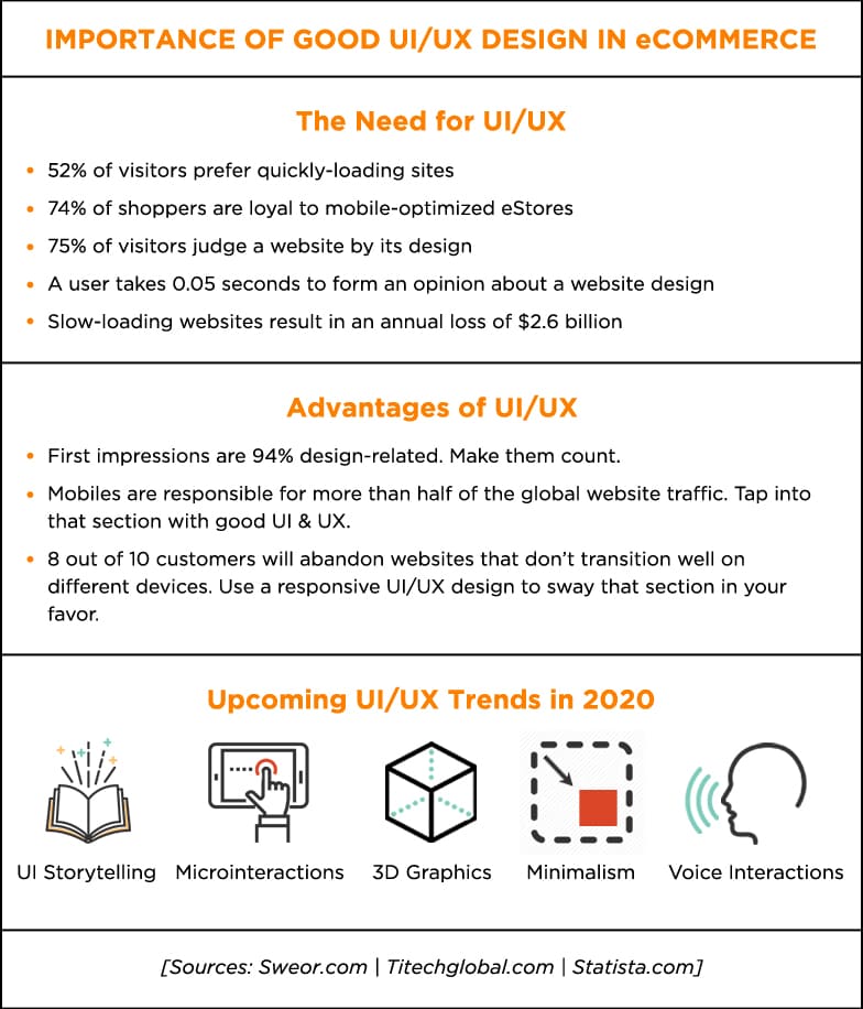
Looking Ahead- Go for a UI/UX Design That Can Convert
Online shoppers of this age and era expect a frictionless shopping experience. If they don’t get it, they simply move along to find a brand that satisfies their expectations. Businesses invest significant capital & even outsource to eCommerce website design companies just to avoid that outcome.
You can dodge that nightmare by ensuring a website design that is as aesthetically appealing as functional.
We’ve discussed a few critical custom eCommerce design aspects that can make a real difference in your conversion figures. In 2020, new trends will surely emerge. You should keep an eye on this space and keep experimenting to see what works for you.
Need More Help?
SunTec India is a custom eCommerce development company with extensive website design experience and a diverse global clientele. Our objective is simple- to help our clients achieve a UI/UX design that turns visiting shoppers into paying customers. We do that with a team of expert developers, designers, and brainstormers.
Grow your brand with SunTec India. Write to us at info@suntecindia.com.


